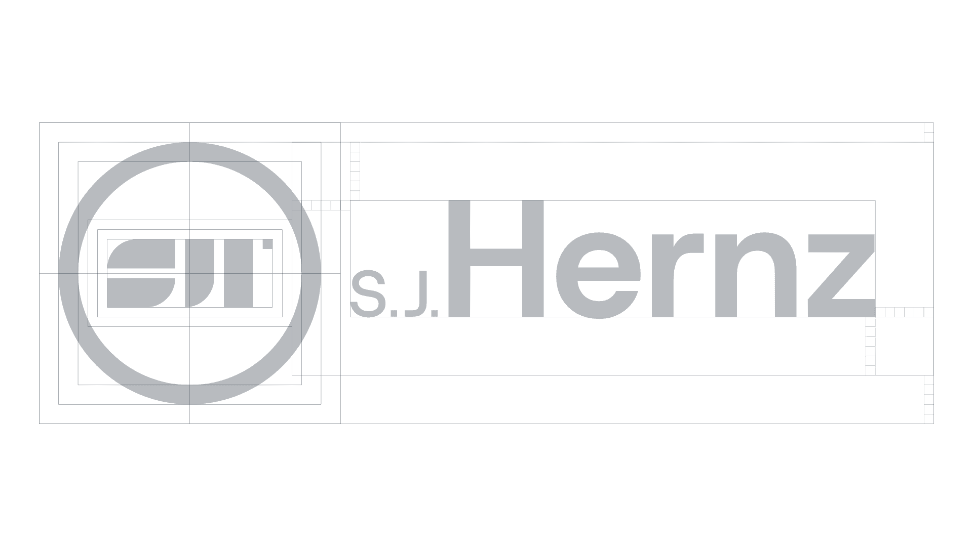
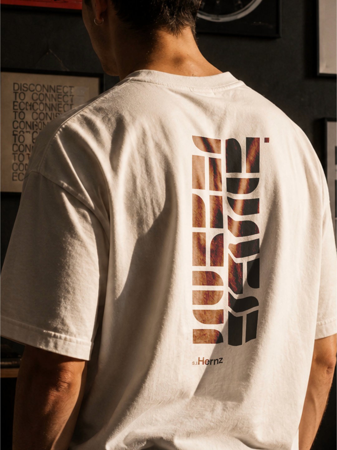
S.J. Hernz
Designing for yourself is uncomfortable in a very specific way.
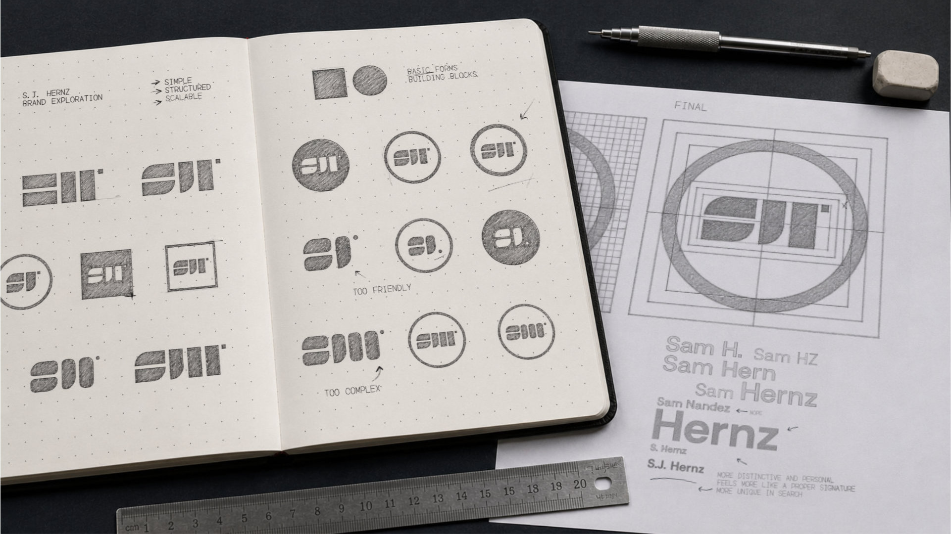
You’re designing something that’s supposed to represent you, but there’s no one to push back, no brief to react to, nothing to tell you when to stop. You can keep refining forever. That’s the trap. So the approach here was to put some pressure back into the process. Treat it like a real project, not a personal experiment that never ends. The only real requirement I set was to keep it somehow geometric. Simple, built from basic forms and ideas, structured, and able to scale without breaking.
Starting with the Name
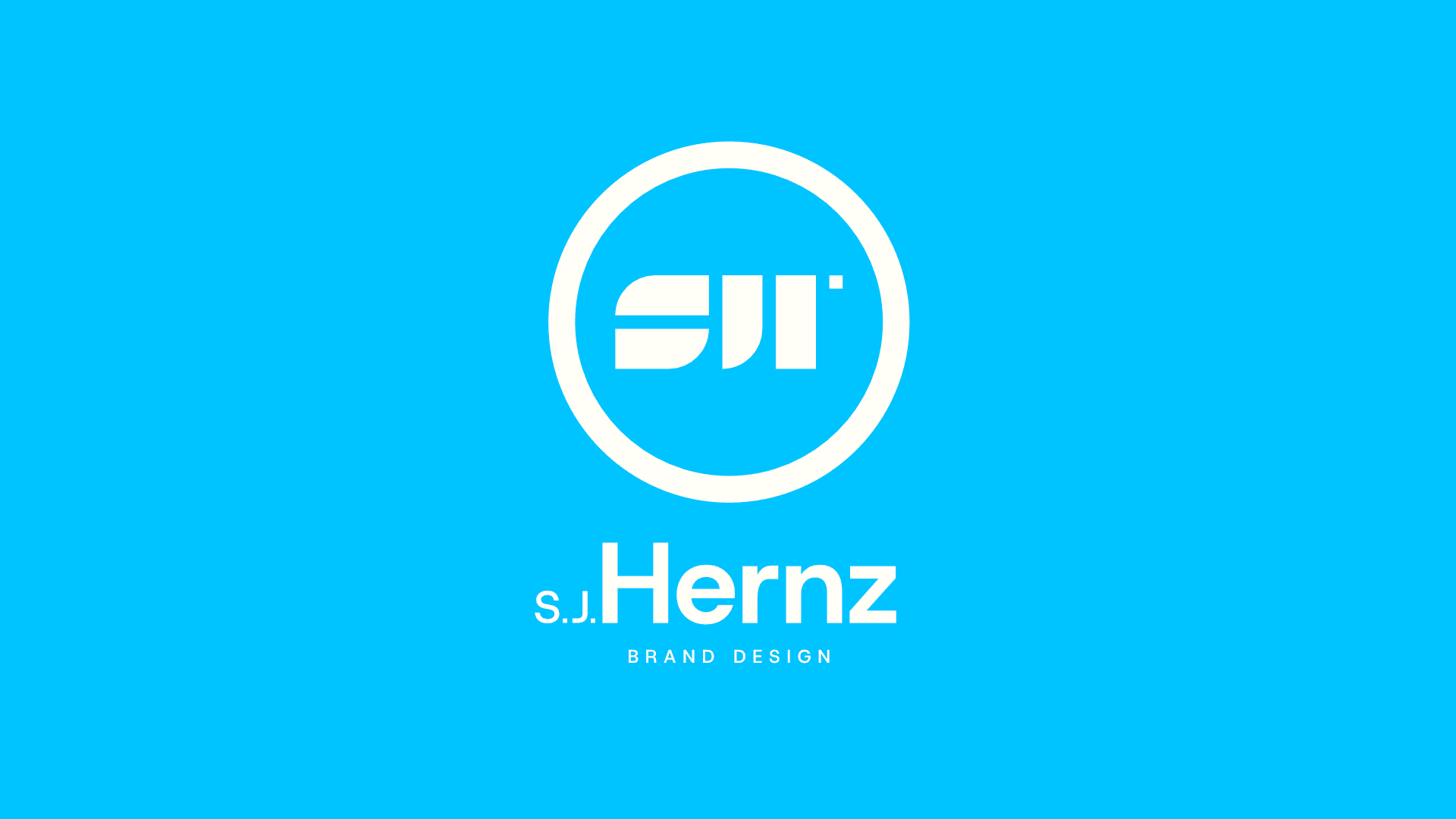
My name doesn’t help much. Samuel José Hernández Moncallo sounds heavy, sorry mom and dad, and Hernández is everywhere. It doesn’t stick. I cut it down. Hernz came from compressing Hernández until it felt sharper and more usable. It still carries where it comes from, but it stops feeling generic. On its own though, it felt a bit detached, almost like a studio name. Adding S.J. brought it back to me. S.J. Hernz sits in that middle space where it reads like a person but behaves like a brand. That balance was the point.
We have a name!

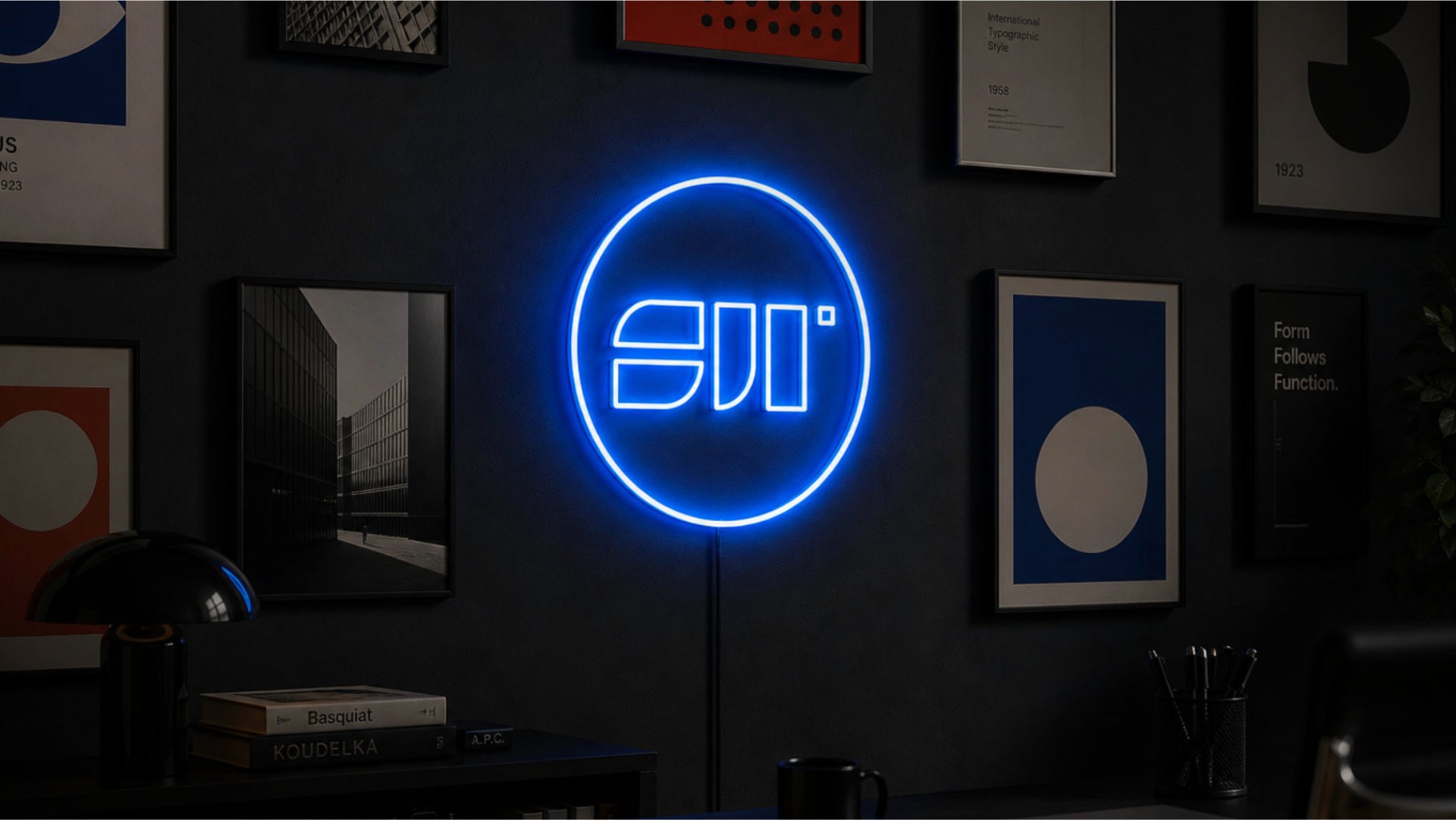
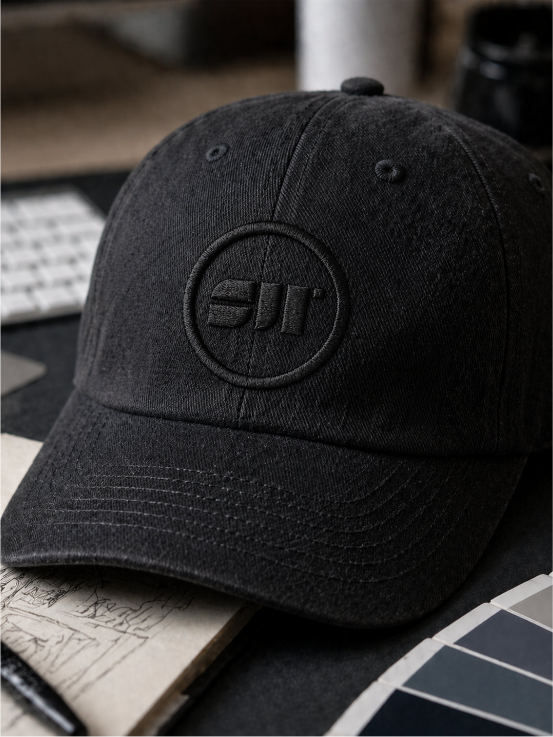
Building the Mark
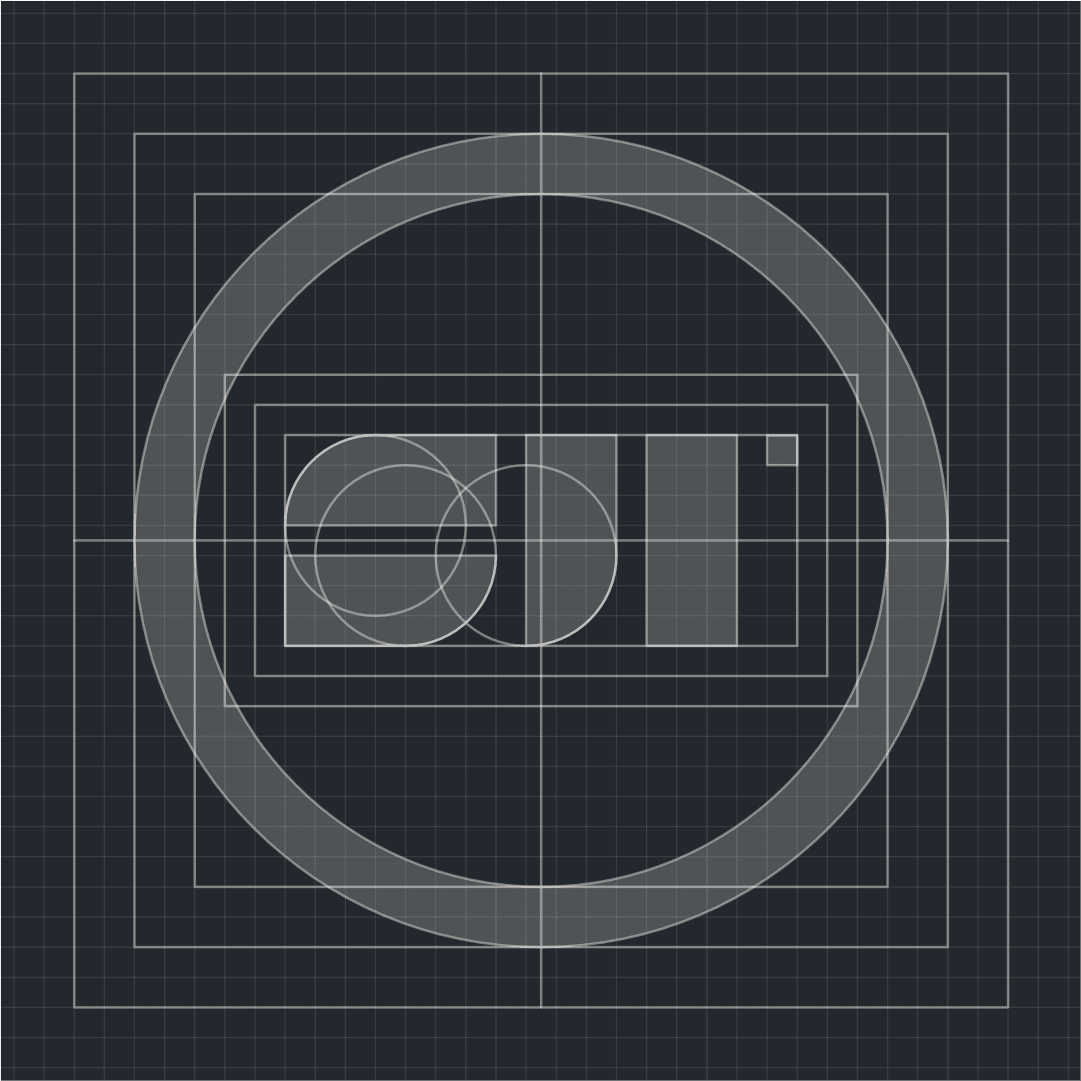
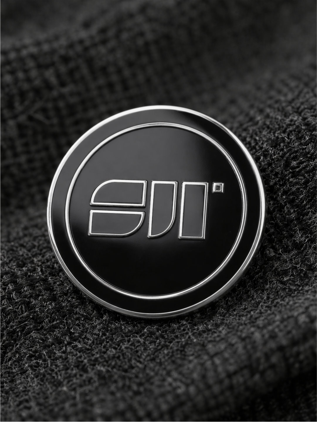
The logo followed the same logic. I didn’t want to draw something expressive or clever. I wanted something that feels like it was always there. The kind of mark you see and think you’ve seen before, even if you haven’t. That meant stripping it down to basics. Circles and squares, nothing else. From there, the form starts to suggest S, J, and H, but not in an obvious way. You don’t read it letter by letter. It just sits there, familiar and stable. More constructed than designed.
That sense of familiarity matters more than originality here. A lot of personal brands try too hard to stand out, and they end up feeling forced. This goes the other way. Keep it simple enough that it blends in at first, then holds up when you look closer.
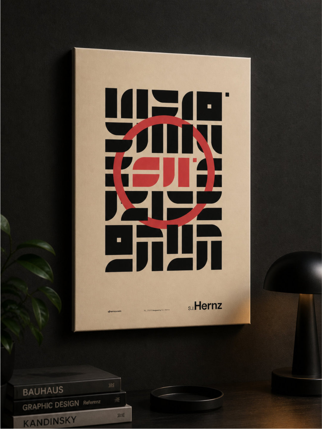
Creating a System, Not Just a Look
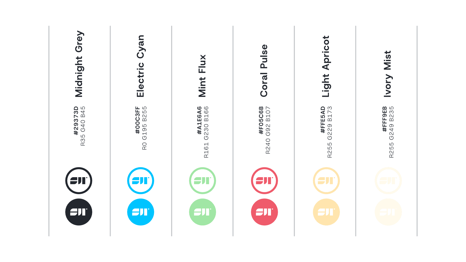
The rest of the system follows that same restraint. The base is quiet. Midnight grey and soft linen do most of the work. They keep things grounded and consistent. Then there’s room to shift when needed through the supporting colors. They’re more expressive, but they don’t define the identity on their own. They just give it range depending on context.
For type, I went with Host Grotesk because it stays out of the way in the right way. It’s structured, clear, and flexible enough to handle different uses without drawing attention to itself. The identity already has a strong core. The type just needs to support it, not compete with it.
Nothing here is trying to be perfect. It’s more about reaching a point where things feel resolved enough to move on. A name that feels owned, a mark that feels familiar, a system that can adapt without breaking. That’s usually where good work happens anyway, somewhere between control and letting go.